+2% EXTRA DISCOUNT FOR BUYING ONLINE


Color in Table Presentation: How to Communicate Your Restaurant’s Style

06 October 2026

Even before the first course arrives, the table is already communicating.

Materials, dinnerware, lighting, and—above all—color create a first impression that helps the customer interpret the kind of experience they are about to have.

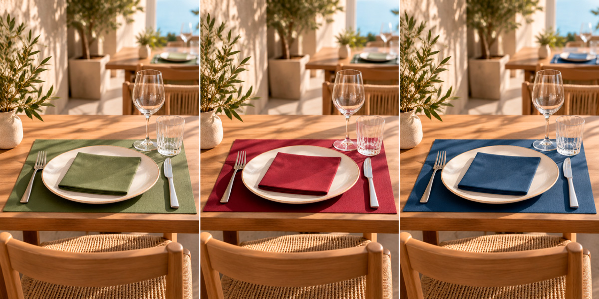
A table set in natural tones can convey a sense of calm and approachability. Green hues can reinforce a concept rooted in plant-based or natural elements. Bold, intense colors can add personality and sophistication. Blues and turquoises can create a visual link to specific Mediterranean themes.

That is why choosing the color of napkins and tablecloths should not be merely an aesthetic decision.

Color is also part of the establishment’s identity.

It is one of the simplest ways to transform the perception of a table setting without needing to overhaul the entire interior design.


The table communicates before the first course

When a customer sits down at a restaurant, they begin to interpret the space even before tasting the food.

Lighting, furniture, dinnerware, materials, and colors all shape expectations regarding the cuisine, the level of service, and the establishment’s personality.

The table setting is part of that overall picture.

A napkin, placemat, or table runner might seem like a minor detail, but they occupy a significant amount of visual space and have the power to noticeably alter the perception of the entire setting.

For this reason, the table should be viewed as an extension of the restaurant’s identity.

We previously discussed this concept in our article on how table presentation influences a restaurant’s perceived value, where we analyzed how small details can help build a more refined and cohesive experience.

Color adds yet another dimension to that strategy.
Color can create different expectations

There is no single “correct” color for a table.

There is, however, a color that is more or less consistent with the concept you wish to convey.

The associations a color evokes also depend on the context, materials, lighting, and the establishment’s own identity.


Natural tones: calm and authenticity

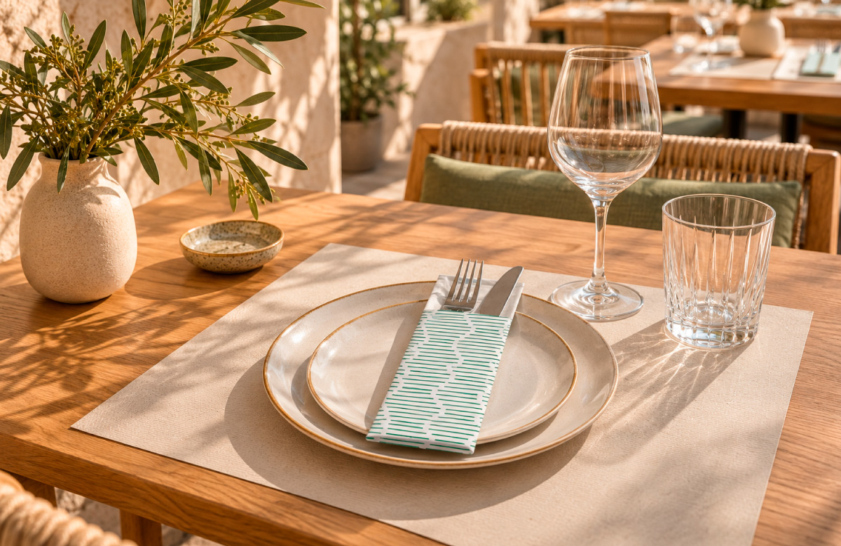
Beige, sand, stone, kraft, linen, and soft browns work particularly well in establishments aiming to project a natural, relaxed, and honest image.

When combined with wood, handcrafted ceramics, or organic-looking materials, they create a warm table setting without the need for excessive elements.

They are especially versatile because they allow the tableware and the food itself to take center stage.

Greens: nature and freshness

Green tones can be visually associated with concepts such as nature, plant-based products, or freshness. They are also frequently used in communications related to sustainability, although the color alone does not certify any environmental attribute.

However, the result varies significantly depending on the specific shade.

Sage green can create a serene, contemporary table setting, while a darker green can add depth and sophistication.

The key lies in combining it with materials that reinforce the concept—such as wood, stone, or ceramics—or with neutral tones.

Bold hues: personality and character

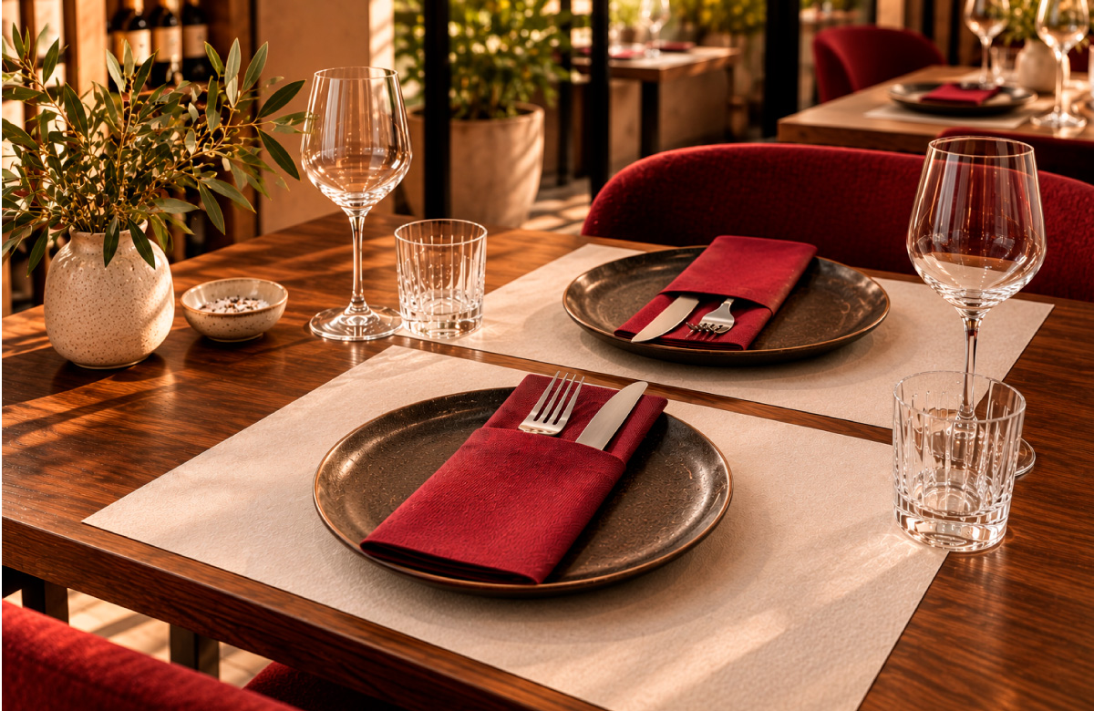
Bordeaux, deep reds, terracottas, or dark tones can become elements with a strong visual presence.

They work especially well when used in a controlled manner.

A napkin in a bold shade paired with neutral dinnerware can be enough to completely transform a table.

There is no need to fill the space with color.

A single, well-chosen splash of color can have more impact than several elements competing with one another.

Blues and turquoises: a contemporary Mediterranean take

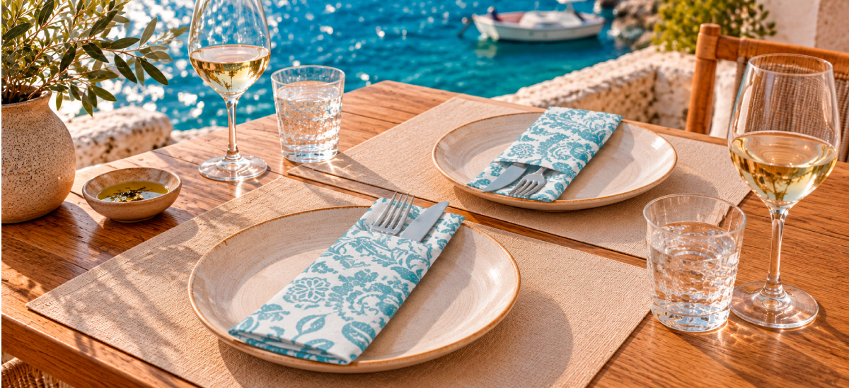
Blues, aquamarines, and turquoises can work particularly well in coastal restaurants or concepts linked to the Mediterranean.

However, automatically resorting to nautical elements is not necessary.

When combined with white, stone, natural wood, and ceramics, these shades can create a much more contemporary Mediterranean aesthetic.

Color establishes a connection with the surroundings without the need for literal representation.

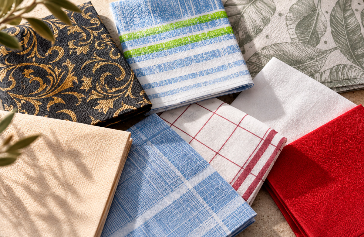
The same color is not perceived the same way across different materials.

A smooth surface reflects light differently than a textured one. A matte finish creates a different feel than a glossy one. And a material with more bulk or thickness can offer greater visual presence, even when using the exact same shade.

That is why, when choosing a napkin or tablecloth for an establishment, we shouldn’t evaluate the color based on a sample alone.


Color and texture must be analyzed together.

Materials such as Airlaid, tissue paper, Novotela, and other non-wovens can yield very different visual results, even if they share a similar color palette.

Restaurant lighting also alters this perception.

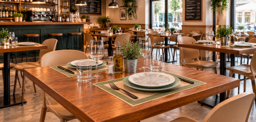
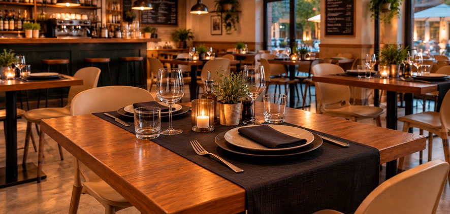
A shade that appears light in natural daylight can take on much greater depth under warm lighting during evening service.

It is this combination of color, texture, and lighting that ultimately defines the actual look of the table setting.


How to build a color palette for the table

You don’t need to work with many colors to create an interesting composition.

In fact, limiting the palette often leads to a more cohesive result.

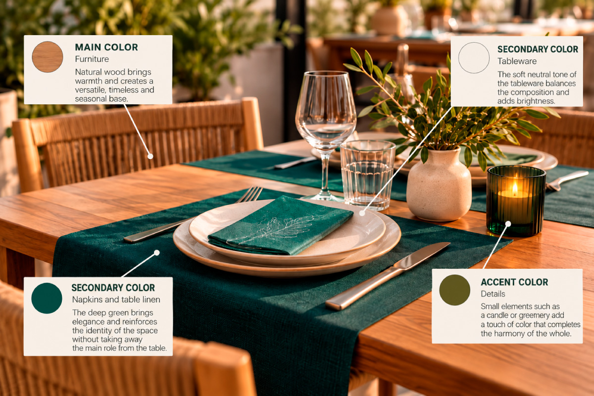
A simple formula involves working with three levels:


Dominant color + secondary color + accent color.

Por ejemplo:

For example:

Dominant: natural wood of the table.

Secondary: petrol green placemat.

Accent: white napkin and small warm details in the cutlery or dinnerware.


Another possibility:

Dominant: stone or beige.

Secondary: white.

Accent: burgundy napkin.


The goal is not to follow a rigid formula, but to avoid having every element carry the same visual weight.

The table needs a visual hierarchy.

Before deciding on a palette, it is worth observing four elements already present in the space: furniture, dinnerware, lighting, and table materials. The color of the napkins and tablecloths should harmonize with these elements, not compete with them.

The napkin can be the element that changes the entire table
Changing the dishes, furniture or interior design represents a significant investment.

The napkin can be the element that changes the entire table
Changing the dishes, furniture or interior design represents a significant investment.

Changing a napkin is much easier.

Precisely for this reason, napkins, single-use tablecloths and non-woven materials allow color to be used as a flexible communication tool.

The same table base can evolve by only modifying the color or design of the napkin.

This allows the presentation to be adapted to:

  • seasonal changes;
  • new cards;
  • terraces and interior spaces;
  • events;
  • special campaigns;
  • changes in the visual identity of the establishment.

Without the need to completely transform the decoration.

It’s not about matching everything

A common mistake when designing a table setting is trying to make every element match exactly.

A napkin in the same shade as the chair. A tablecloth the same color as the wall. Dinnerware coordinated with both.

The result can end up feeling too rigid.


An interesting table setting needs coherence, but also contrast.

If the space already has a strong color personality, the table might work better with neutral tones.

If the interior design is very clean, a colorful napkin can become the element that defines the style.

If the dinnerware features a bold design, it might be best to minimize other visual distractions.

Color should help organize the table visually, not overwhelm it.


Table presentation also builds the brand

When specific colors, materials, and shapes are used consistently, they become part of the restaurant’s visual language.

A customer might not remember the exact shade of a napkin.

But they may well remember the feeling that table conveyed.

Natural.

Elegant.

Casual.

Contemporary.

Mediterranean.

Sophisticated.


That coherence between space, cuisine, and presentation helps build a recognizable identity.

That is why the choice of napkins and tablecloths can go far beyond their practical function. With custom napkins, for instance, color and design can reinforce the establishment’s visual identity.

It is part of the experience.


The goal isn’t to add more decoration; it’s to communicate better.

Using color on the table doesn’t mean adding more elements.

In many cases, it means the exact opposite: making better choices.


A napkin in the right color, a contrasting placemat, and cohesive dinnerware can be enough to create a table setting with real character.


Before choosing a color, we can ask ourselves a simple question:

What do we want the customer to perceive when they sit at our table?

From that point on, color ceases to be merely decoration.

It becomes communication.

Frequently asked questions about using color in table settings


How should a restaurant choose napkin colors?

It is best to start with the establishment’s identity, the color of the furniture and dinnerware, the lighting, and the type of experience you wish to convey. You do not need to use your exact corporate colors; a complementary color palette can often look more natural on the table.

Is it better to use neutral or colored napkins?

It depends on the overall look. Neutral tones are versatile and allow other elements to take center stage, whereas a colored napkin can serve as a focal point and add personality to a simple table setting.


Does the material affect color perception?

Yes. Texture, embossing, finish, and the way the material reflects light can all alter how a color is perceived. That is why it is advisable to consider color and material together.


How should tablecloths and napkins be combined?

A simple approach is to establish one dominant element and use the other to create contrast. They do not have to be the same color. Combining neutral tones with an accent color often makes it easier to create a balanced look.


Can the table setting be changed according to the season?

Yes. Changing napkins, placemats, or table runners allows for seasonal updates without replacing dinnerware or furniture. It is a simple way to visually refresh the table while maintaining a consistent identity.


How does lighting affect table colors?

Lighting can significantly alter color perception. The same shade may appear lighter in natural light and take on greater depth under warm lighting during evening service. Therefore, whenever possible, it is best to evaluate napkins and tablecloths under the establishment’s actual lighting conditions.

How many colors should be used on a table?

There is no set rule, but working with a limited palette makes it easier to maintain visual consistency. A combination of dominant, secondary, and accent colors can be a good starting point.

Comment


Privacy Overview

This website uses cookies so that we can provide you with the best user experience possible. Cookie information is stored in your browser and performs functions such as recognising you when you return to our website and helping our team to understand which sections of the website you find most interesting and useful.